Friday, August 20, 2010

STORYBOARDS

                                                        PRO-LINE Motions
Some storyboards I figure I'd post... just because. This was for some hair product called "Motions" that's popular in urban salons. This was a last minute job I had taken on in the midst of doing some other illustration work. Never try that at home...  :) Next time I wont let money dictate the work. I found out the hard why the body needs sleep... lol.




STORYBOARDS

                                               
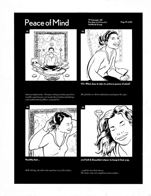
                                                PRO-LINE  Soft & Beautiful
Another board I did,this time for a Pro Line hair care product "Soft & Beautiful".Sorry about the resolution. Couldn't find the original files. Might be on my other hard drive.I'll post a better copy when
I get to looking for it. Until then, enjoy. Any questions or comments, feel free to hit the comment section.
Peace....


Tuesday, July 6, 2010

AUTO-BOARDS... ROLL OUT!

      TILL THE WHEELS FALL OFF... 
Here are some automobile boards and references I've been meaning to post for a minute now. Had to show how I put it down...  so I dug these up. I don't get to do as much auto work as I would like. Well actually, I  didn't use to like doing car work in the earlier years because of the limited input you have in drawing the cars. It has to look exactly like the car... no if, and or buts... lol. I got over that though... Hopefully in the near future, I'll put up more work along with the process. Just been busy with a few side projects which I hope to share with you guys. So, sit back and enjoy for now.


ALL EYEZ ON ME...

Some facial expression reference I did that I thought I'd post up. Not for props... just for the hell of it.
If you want to give me my props also... hey...who am I to judge... :)


Monday, July 5, 2010

STORYBOARDS

LISTEN UP,  I HAVE A STORY TO TELL...

Since man can't live off of spot illustrations alone, in the past few years, I delved head first into doing a lot of storyboard work for a few ad agencies. I've done some boards in the past, mostly music video work. But recently, I've almost exclusively had my hand in the ad game since honestly, the pays good and the work is fast. Sometimes almost too fast. With some quick turn arounds being same day, I've had a few sleepless nights... (lol.)
I figured, in no particular chronological order, I'd share a few of my boards with you guys, along with a brief history of how things came about.


McDONALD'S
This was a spec job I did for an art director who wanted to see how I worked off of a script he had written. At the time, I had only a few storyboard pieces in my book, so I obliged his request. Needless so say, I blew him out the water ... lol. I think I continued to do work with him for  some years after. Sorry up front, I couldn't find the working script that went with the panels... and I got tired of looking for them. Just enjoy the art and stop complaining.... lol.


Saturday, July 3, 2010

STORYBOARDS

                                                               MOTOROLA
This was one of the first jobs I did over at UWG. It had something to do with Motorola introducing some some new (now antique) texting device. I remember having to do 2 versions of this board, since the first ones weren't "hip" or urban enough, for who the client was targeting. They ad had featured the guys behind FUBU, So I guess that was the only daunting part; finding what those cats looked like and rendering them decently.


Friday, July 2, 2010

STORYBOARDS

                                                                  COLGATE
This was a pretty standard piece I did for Uniworld for their client Colgate. Maxfresh toothpaste launch I believe. Another sort of last minute job handed to me that I had to bang out for a next day presentation. Don't be fooled by the amount of panels shown.The amount actually rendered were considerably higher. And this is only 3 pages of the 8 pages presented. Wasn't too comfortable with some of the frames but it was what the Art director original breakdown called for, so why bitch... lol. I really loved how the pages are designed in a sort of letterbox layout with the seductive red glow in the backdrop, giving it more of a  alluring feel. It actually makes my boards pop out. Like I really need that... lol


Thursday, July 1, 2010

STORYBOARDS

                                                        TIME WARNER CABLE
I remember this being a fairly big job, encompassing a lot of boards, scripts and revisions. This ad not only embodied television but Time Warner cables web presence as well. I should be more familiar with the spots, but in actuality, I vaguely remember what the overall theme was... Needless to say though, it was a quick turn around...like almost all storyboards are. Yet this one went relatively smoothly since the Art Director knew exactly what he was looking for and only revisions that came in was on minor things like
clothing adjustments and the like. There were something like 8 individual spots with an average page coverage of 6 panels... that were used. About half that amount came with last minute changes/revisions. So in all, about 60-65 panels were created yet I can barely recall the spots theme. Sad. What else have I forgotten so easily...lol.


Thursday, February 4, 2010

BRAND KANYE

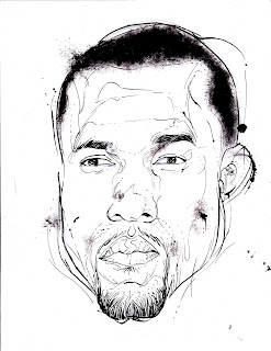
Working over at BrandMakernews has allowed me, as a writer, a freedom that I sometimes miss with art.The freedom of an unfettered thought, playing itself out, from beginning to end. But of course I still get the urge to lay pen to paper and let a brother know how I put it down... lol. So when the opportunity presented itself for me to illustrate a piece my brother, Creative Director David Harley was working on, I jumped at the chance. The piece, the first of many to come, was a brand driven profile on Kanye West in the sites newly serialized section  Brand Universe. After getting some of the facts on the article, I sent him these:
 

After a few drafts, we concluded that less was more and decided to go the straight portrait route.


This B&W study was ok , but it didn't get the feeling and energy David was going for in the piece. It seemed too stodgy and illustrative. Too much line work. Since he wanted a cleaner look, I decided to go a different way and play up the simple cohesiveness of Dave prelim design:


Now that's that shh right there! I wake up just to do this. Clean, flashy and fly. Just like yours truly... lol.


Some extra design elements are place around the portrait to set off,  then all I had left to do really, was sit back and admire Dave's design work....


Blaow!! Tell me that ish ain't hot... lol